Fleet and resource planning is the foundation of efficiency in waste management. Whether it’s ensuring vehicles are fully utilised or managing resources to meet customer demand, getting it right can make the difference between smooth operations and unnecessary costs. The challenge, however, lies in making sense of the enormous amount of data involved. That’s where better data visualisation comes into play.
The Complexities of Fleet and Resource Planning
The waste management sector deals with a multitude of moving parts. Vehicles need to be routed in the most efficient way possible, taking into account traffic patterns, fuel costs, and time constraints. Resources must be allocated to match demand while avoiding overcommitment. At the same time, there’s the ever-present need to monitor vehicle maintenance, manage compliance, and respond to unexpected changes, like breakdowns or delays.
All of this generates a massive amount of data. But the real challenge isn’t collecting the data—it’s interpreting it. Numbers in a spreadsheet or raw datasets can overwhelm even the most experienced managers. Without clarity, opportunities for efficiency are easily missed, and reactive decisions can take the place of proactive planning.
The Transformative Power of Data Visualisation
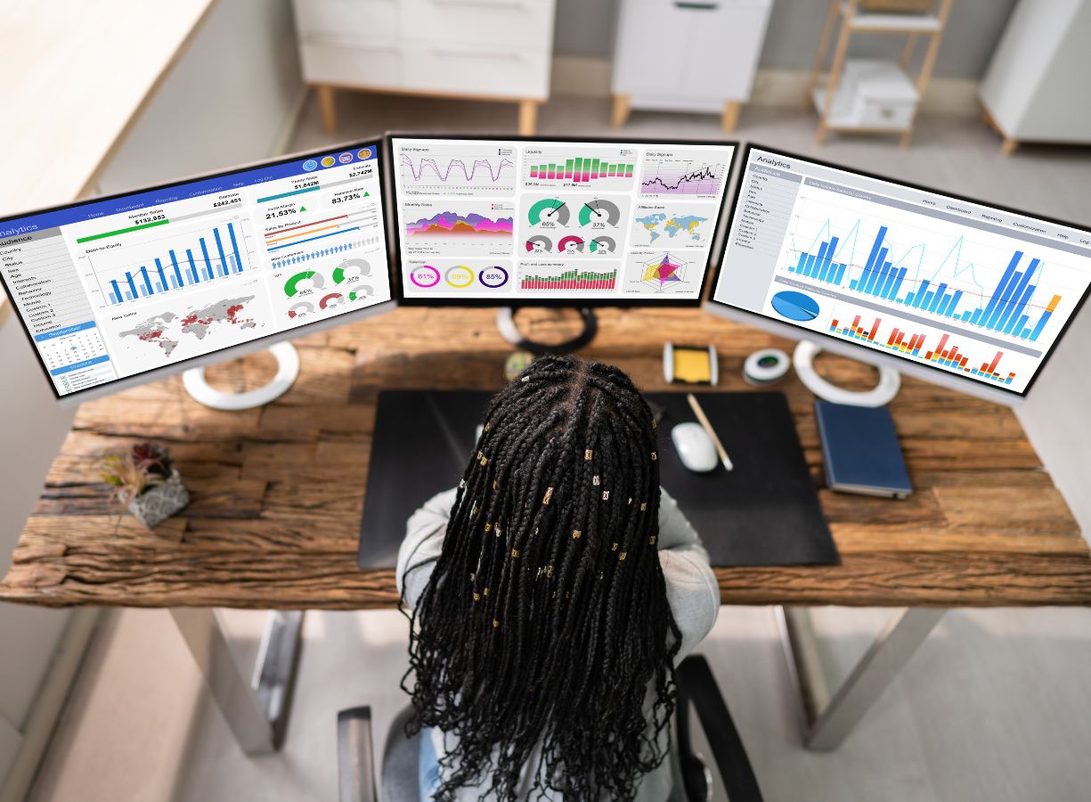
Data visualisation bridges the gap between raw data and actionable insights. By presenting information in a visual format—think dashboards, heatmaps, and interactive charts—it becomes far easier to spot trends, identify bottlenecks, and make informed decisions.
Imagine being able to see a live dashboard showing your fleet’s performance: which vehicles are operating at full capacity, where delays are occurring, and how routes could be adjusted in real-time to save fuel and improve productivity. Or consider a visualisation of resource allocation, helping you balance workloads across teams and avoid unnecessary overtime. With these kinds of tools, decisions are no longer guesswork—they’re grounded in clear, real-time insights.
Technology That Makes It Possible
Data visualisation doesn’t happen in isolation. It requires robust technology that can collect, integrate, and process data from various sources. Advanced ERP systems like PurGo are designed to do just that. By centralising information—vehicle tracking, maintenance schedules, fuel usage, and more—these systems lay the groundwork for effective visualisation.
Our partner, Amarji has developed tools that work seamlessly with platforms like PurGo. Their dashboards and visualisation solutions are tailored specifically for the waste management sector, providing insights that help operators quickly identify inefficiencies and make improvements. These tools aren’t just functional; they’re intuitive, empowering managers and teams to make data-driven decisions with confidence.
Beyond Day-to-Day Operations
The impact of better data visualisation extends beyond improving daily operations. It can significantly enhance customer service, for instance. With real-time visibility into routes and schedules, businesses can provide accurate updates to customers, improving reliability and trust. Visualised data can also help identify long-term trends, enabling better forecasting and strategic planning. Whether it’s deciding where to expand services, when to invest in new vehicles, or how to reduce emissions, the insights gained from effective visualisation are invaluable.
Sustainability is another area where visualisation makes a difference. By highlighting inefficiencies—such as excessive fuel consumption or underutilised vehicles—companies can take targeted action to reduce their environmental impact. In an industry increasingly focused on sustainability, this isn’t just a bonus; it’s a necessity.
Taking the First Steps
If you’re looking to maximise the benefits of data visualisation in fleet and resource planning, start by evaluating your current systems. Do they provide the data you need? Are they integrated in a way that allows for seamless visualisation? If not, it may be time to consider upgrading to a more comprehensive solution.
Choosing the right visualisation tools is equally important. These should align with your specific operational needs and be user-friendly enough for all stakeholders to engage with. Training is key too—ensuring your team understands how to use these tools effectively and interpret the insights they offer.
At VWS Software Solutions, we’ve seen firsthand how better data visualisation can transform operations. Working with Amarji, we’ve integrated advanced visualisation tools into our systems, helping waste management businesses unlock efficiencies, cut costs, and plan with greater confidence. In an industry where every decision matters, the ability to see the bigger picture has never been more important.

